


JourneyGo Case Study

JourneyGo
ROLE: Product Designer, end to end (strategy, UX, UI, prototyping)
OVERVIEW
JourneyGo is a collaborative travel planning app designed to help groups move from scattered ideas to a clear, shared itinerary without the stress of endless back and forth.
SCOPE
Design Sprint (adapted):
UX strategy
Empathize
Define
User research
Design system
Prototyping
A/B Testing
Iterate
PRODUCT
Trip setup
Activity selection
Preference flows
Shared itinerary
Trip details
Group coordination
TIMELINE
2 Weeks
TOOLS
Figma
Notion
Zoom
Stack
PROBLEM
Group trip planning often breaks down once decisions need to be made. Conversations fragment across chats, details get lost, and progress stalls due to differing preferences and unclear ownership.
Most travel apps focus on booking logistics, leaving groups without tools to align, decide, and stay organized. Planning becomes stressful and inefficient as a result.
SOLUTION
JourneyGo reduces group planning friction through collaborative decision-making and structured organization. Guided interactions help groups reach consensus quickly, while a shared space keeps all trip details in one place.
The experience is designed to lower cognitive load and make planning feel shared rather than overwhelming.
PRODUCT VISION
JourneyGo aims to make group travel planning feel calm, collaborative, and decisive by prioritizing alignment and organization over booking logistics.
DIFFERENTIATION
Designed specifically for group coordination, not solo booking
Decision support during planning, not just after choices are made
Centralized itinerary that keeps everyone aligned
DISCOVERY
SECONDARY RESEARCH
I focused discovery on understanding how groups make decisions and why planning often stalls after initial ideas are shared. Research consistently pointed to commitment and alignment as the primary breakdown points in group coordination.
Key insights
People are more likely to commit when decisions feel participatory rather than imposed
Interactive decision-making increases engagement and follow-through
Most travel apps support logistics, but not group alignment
COMPETITIVE ANALYSIS & THE GAP
Most existing travel products optimize for discovery, pricing, or individual organization. Few address the collaborative decision-making challenges that arise when planning as a group.


TARGET AUDIENCE & USER PERSONAS
Who Will Use This App?
Primary age 20-35
Frequent travelers, friend groups, family trips planners
User Personas
Spontaneous traveler who enjoys fun, hassle-free trip planning but struggles with group decisions.
Sarah Kim: Organized planner who values structure but wants an easier way to gather group input.
USER JOURNEY MAP
Understanding user psychology to identify key behaviors, emotions, and opportunities across the ChainTunes experience.


INSIGHTS & ANALYSIS
Theme 1: Collaboration
Users want a way to vote and decide easily.
PRODUCT
Group input should be quick and seamless.
TIMELINE
A shared decision-making process reduces conflict.
Theme 2: Engagement
Decision-making should be fun, not frustrating.
PRODUCT
Interactive elements keep users engaged.
TIMELINE
A playful approach makes planning more enjoyable.
heme 3: Structure
A structure but intuitive experience is needed.
PRODUCT
Clear navigation prevents confusion.
TIMELINE
Users want guidance without feeling restricted.

USER FLOW
Creating user flows helped me understand how I wanted each screen to be laid out to guide users in completing their tasks.
EARLY EXPLORATION
Early exploration focused on defining the core flow and interaction patterns that would help groups make decisions quickly and stay aligned. These concepts helped shape how planning, participation, and progression would work together in the product.
SKETCHING
Sketching helped me bring the app’s user flows to life. During this process, I developed a clear vision for the app’s look and feel — modern and minimalistic.


USABILITY TESTING & KEY DESIGN IMPROVEMENTS
I conducted the first of three usability testing rounds to refine JourneyGo’s design. This round uncovered user pain points that led to my first set of design improvements. These early insights guided meaningful updates that enhanced clarity, usability, and engagement.
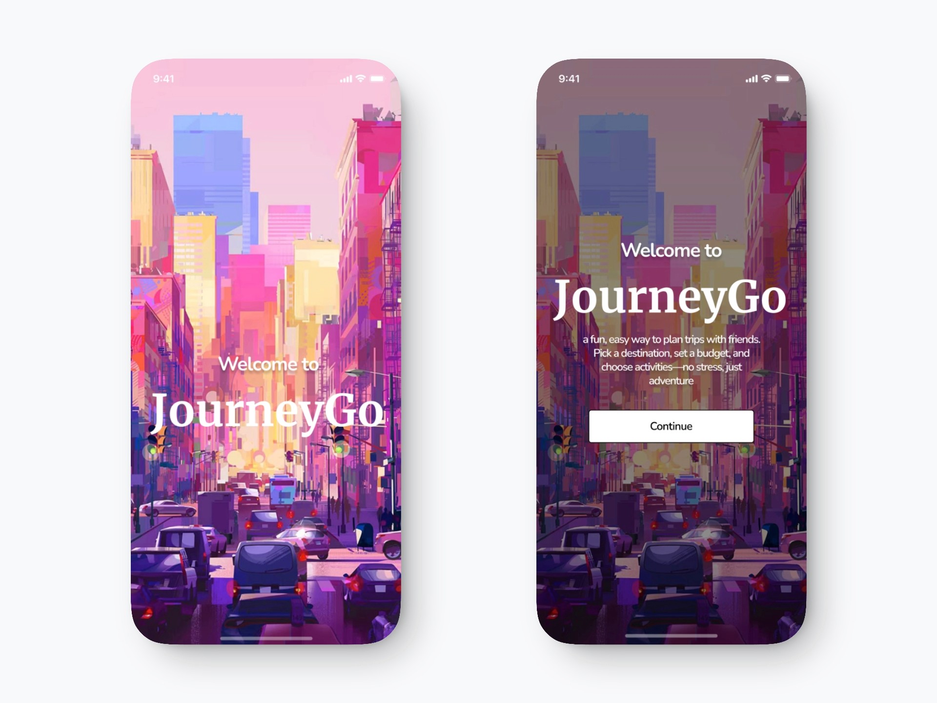
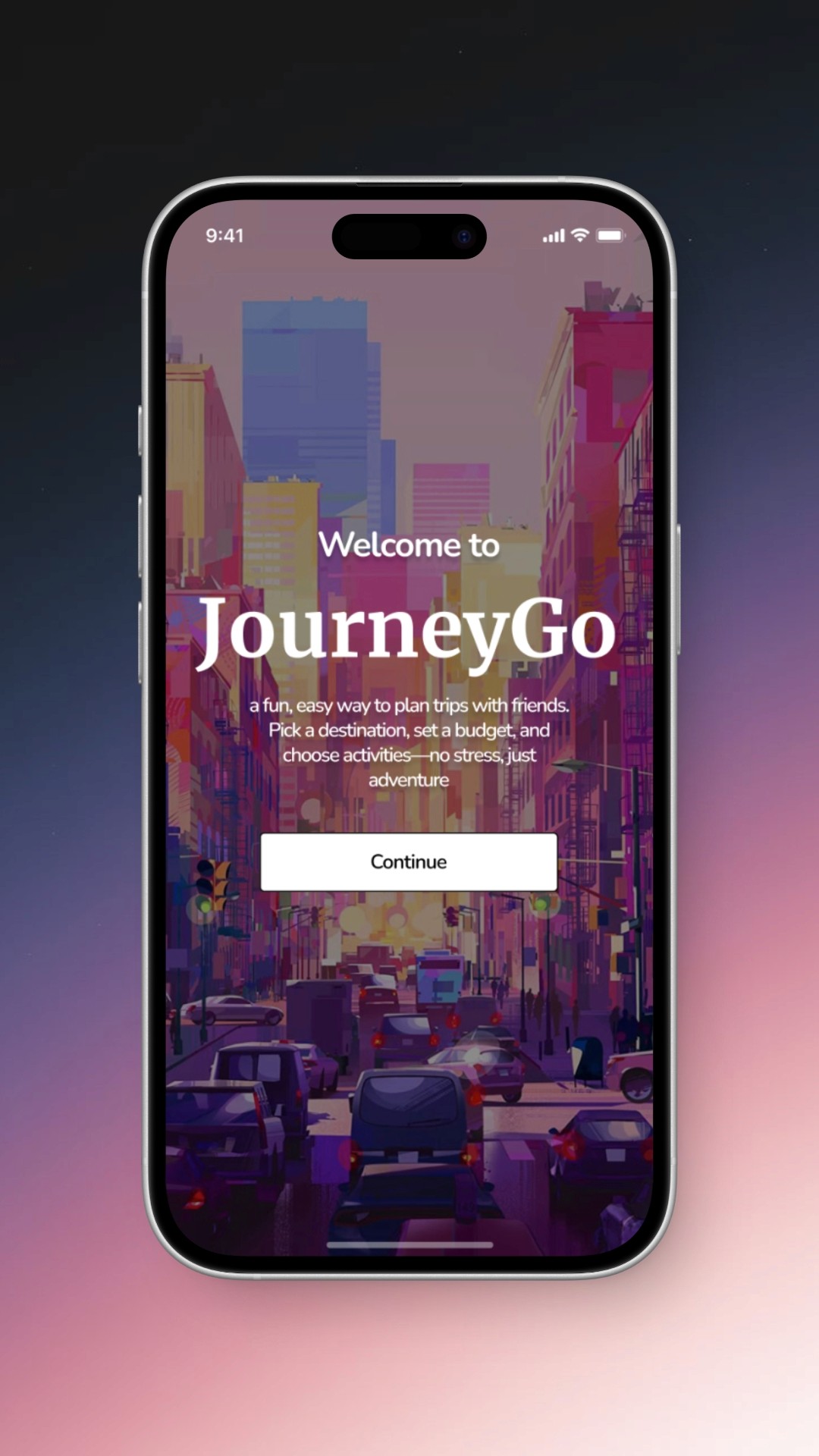
Clearer Onboarding Experience
Before → After
Why This Change?
Switching to a gradient color scheme adds visual depth and modern appeal, making the interface more dynamic and engaging. This subtle change enhances user experience by creating a contemporary look and helping content stand out.
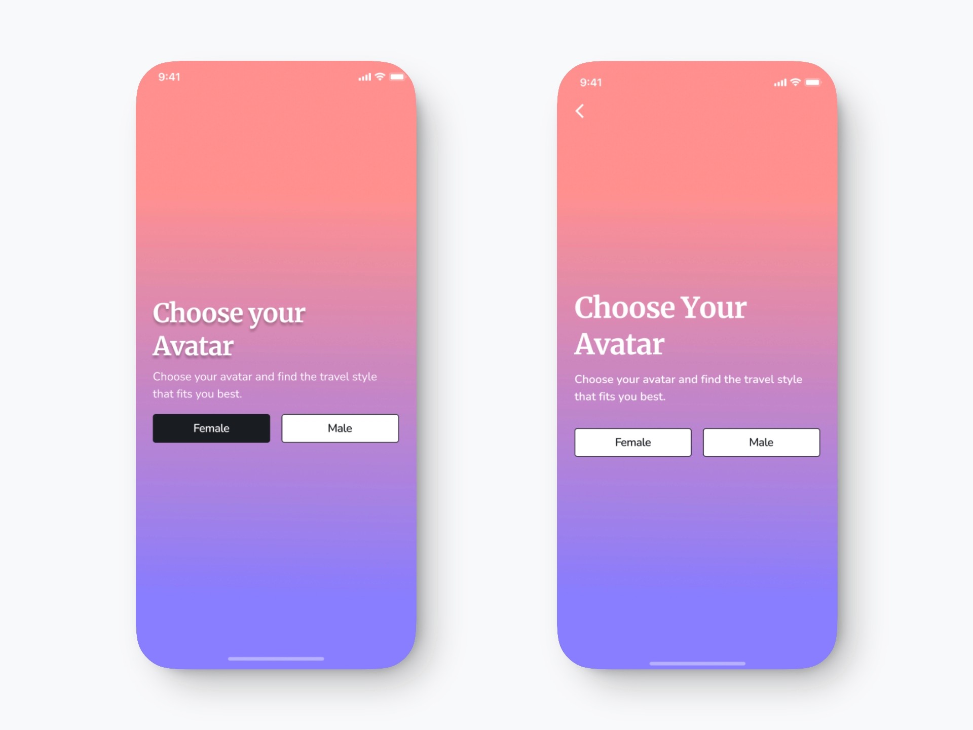
Avatar Selection Screen Update
To improve navigation and usability, I added a back button to the top left corner, aligning with standard mobile design patterns. I removed the shadow from the title for a cleaner and more modern visual hierarchy, increased the font size for better readability, and added spacing between the headline and supporting text to enhance accessibility and content scannability. Additionally, I unified the design of the “Female” and “Male” buttons to reduce cognitive load and prevent selection bias, ensuring a more balanced and inclusive user experience.
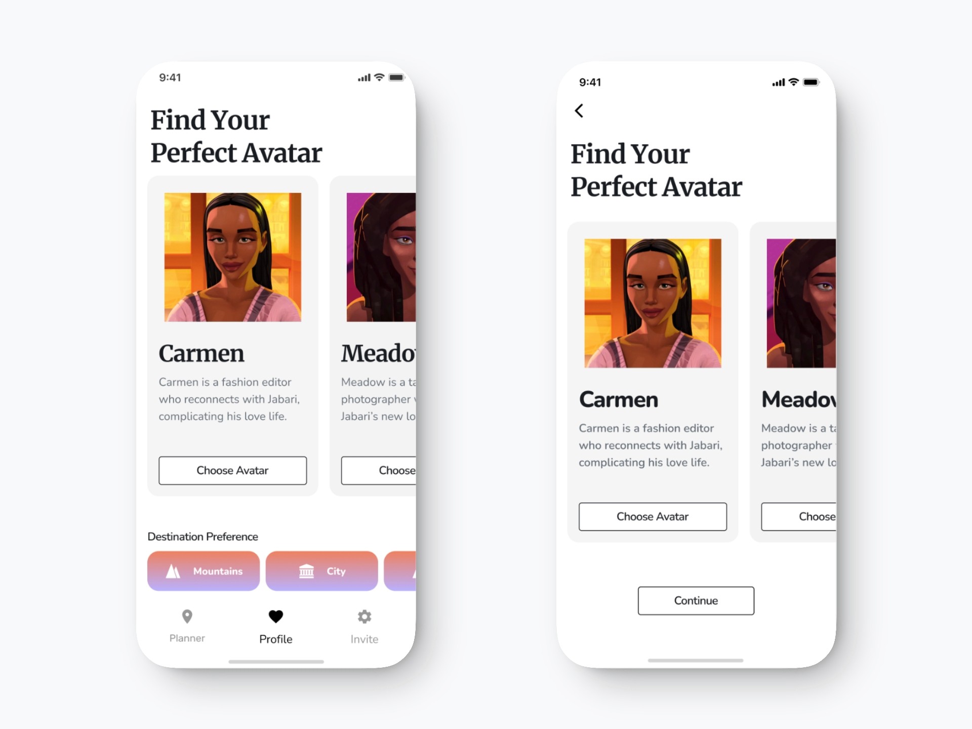
Avatar Selection Update
I added a back button for clear navigation and removed the destination preference bar and bottom nav to keep the user focused on avatar selection. The “Continue” button was added to guide users to the next step, and the avatar cards were centered to reduce empty space and improve layout balance.
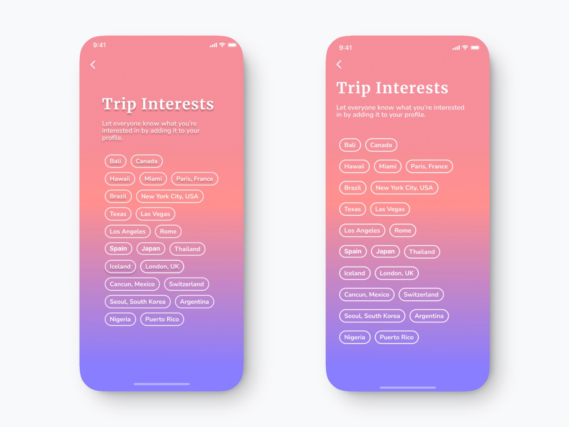
Trip Interests Screen Update
I removed the drop shadows from both the heading and location tags to create a cleaner, more modern look and improve legibility. The title and supporting text were realigned to match the position of the back button and maintain layout consistency across screens.
I also increased vertical spacing between the interest tags to reduce visual clutter and improve tap target accessibility, making it easier for users to scan and interact with the options. These adjustments enhance readability, accessibility, and design consistency throughout the flow.
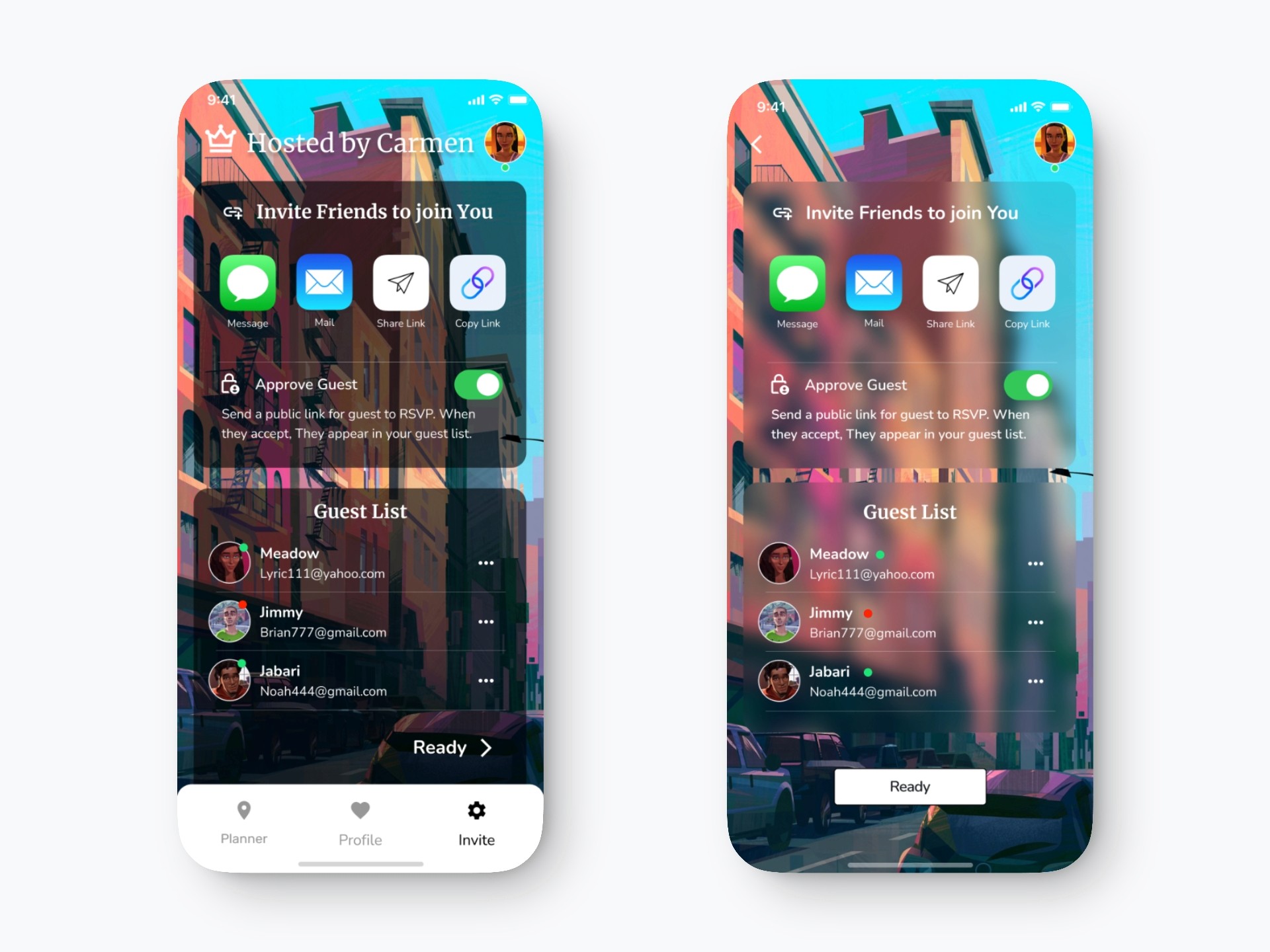
Group Status Screen Update
I added a back button for smoother navigation and removed the bottom navigation to reduce distractions. The status indicators (green/red dots) were moved next to each name for better clarity and alignment with user expectations. I also introduced a blur background effect to create visual depth and elevate the overall aesthetic. Finally, a “Ready” button was added to clearly signal the next step and improve task flow.
USABILITY TESTING & REDESIGN

To evaluate how users navigate and complete tasks in the app, I conducted usability testing with real users. Their feedback helped uncover key pain points around navigation, clarity, and visual consistency.
Users suggested adding a back button, improving typography, and removing confusing or unnecessary sections etc. Based on these insights, I refined the UI by simplifying navigation, removing a few screens, and ensuring a more consistent and intuitive experience from start to finish.
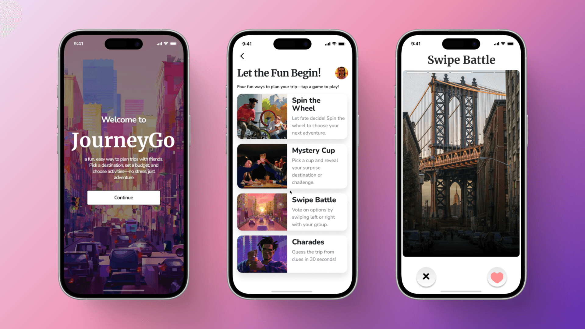
FINAL DELIVERY
The final visual system was refined to support clarity, hierarchy, and mood-driven discovery.

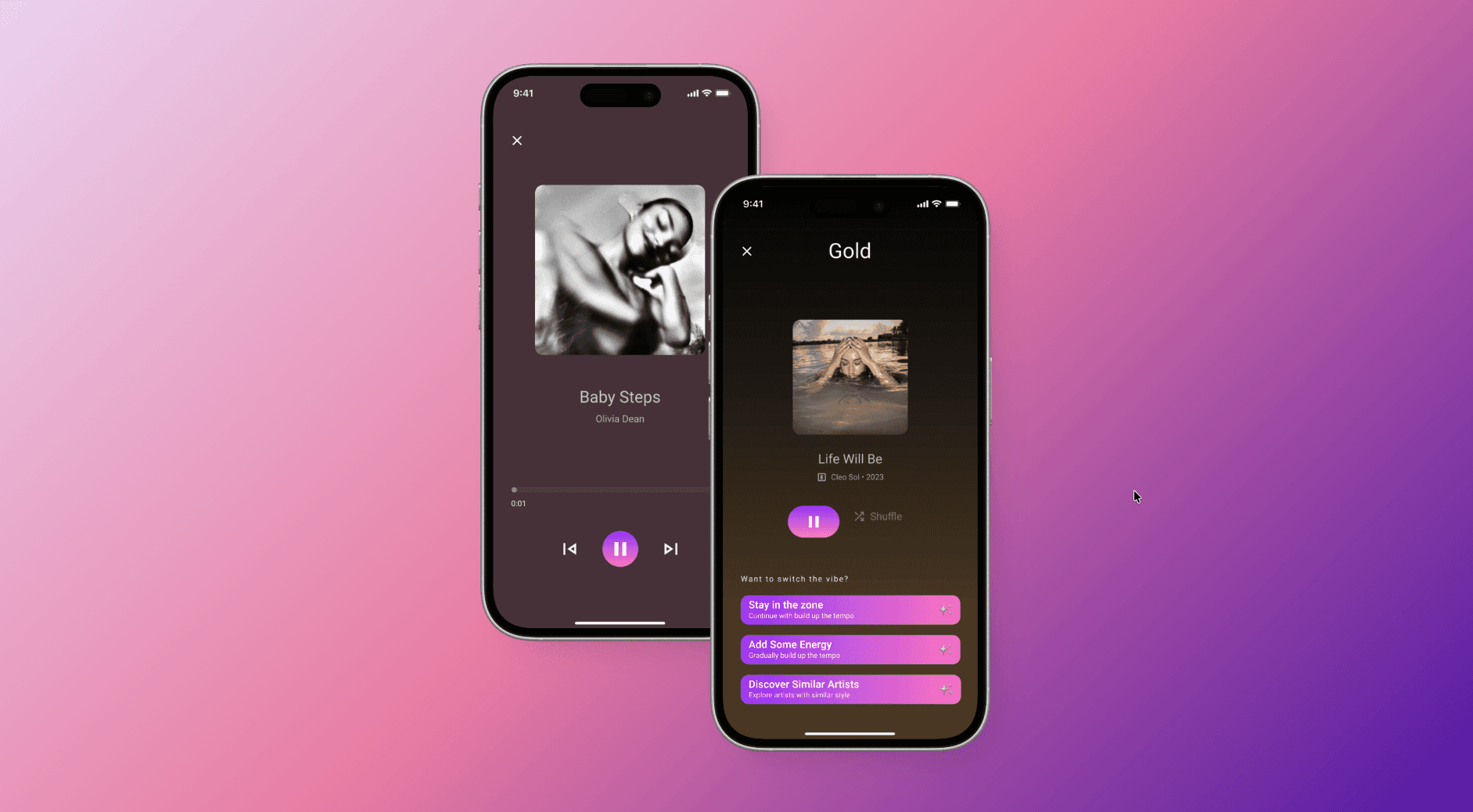
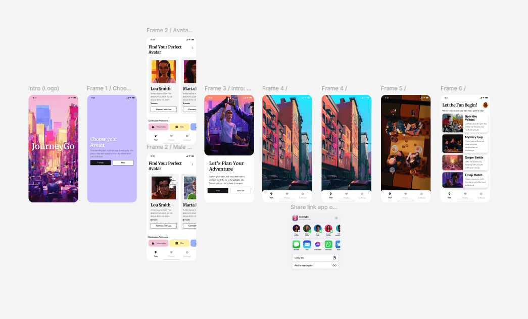
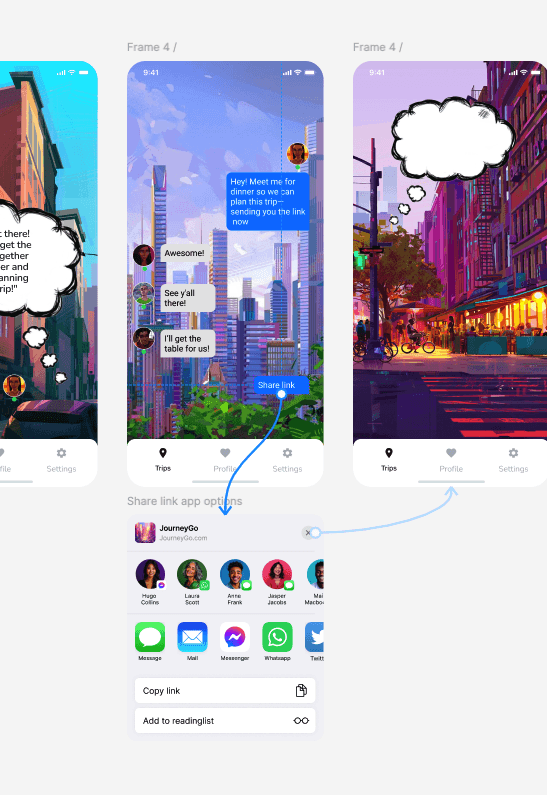
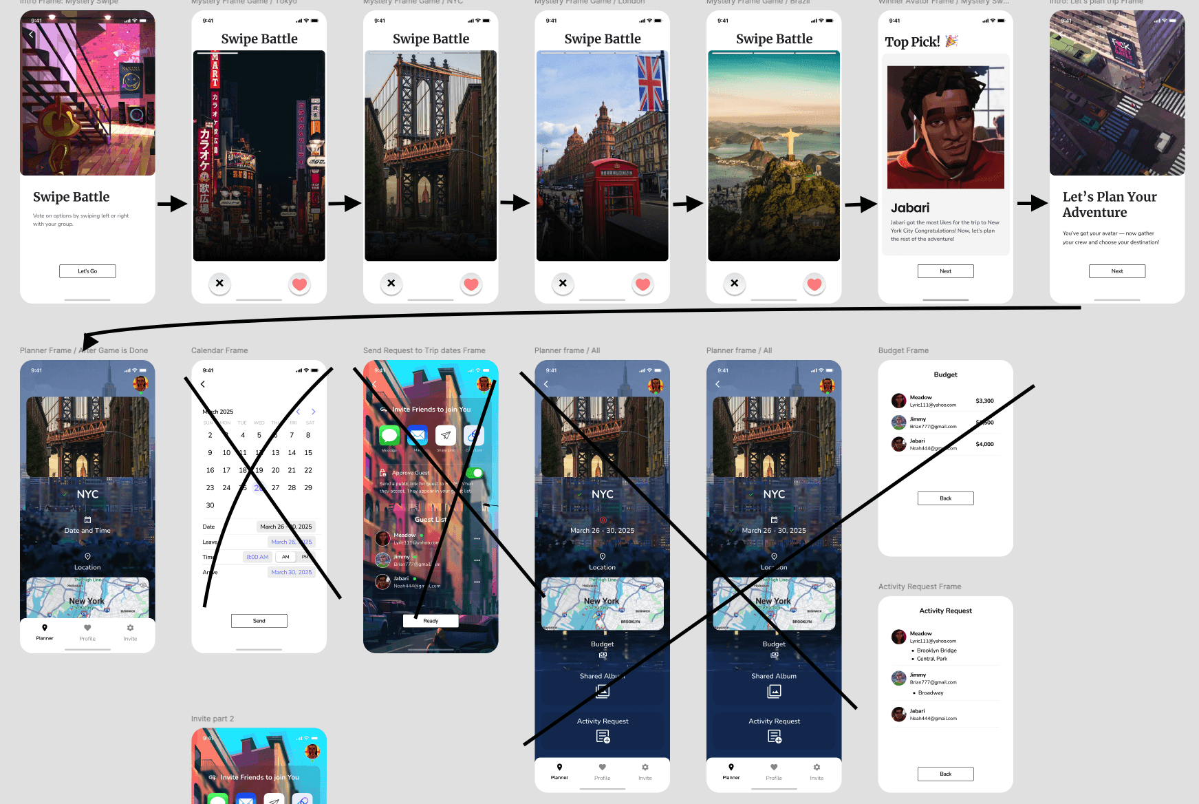
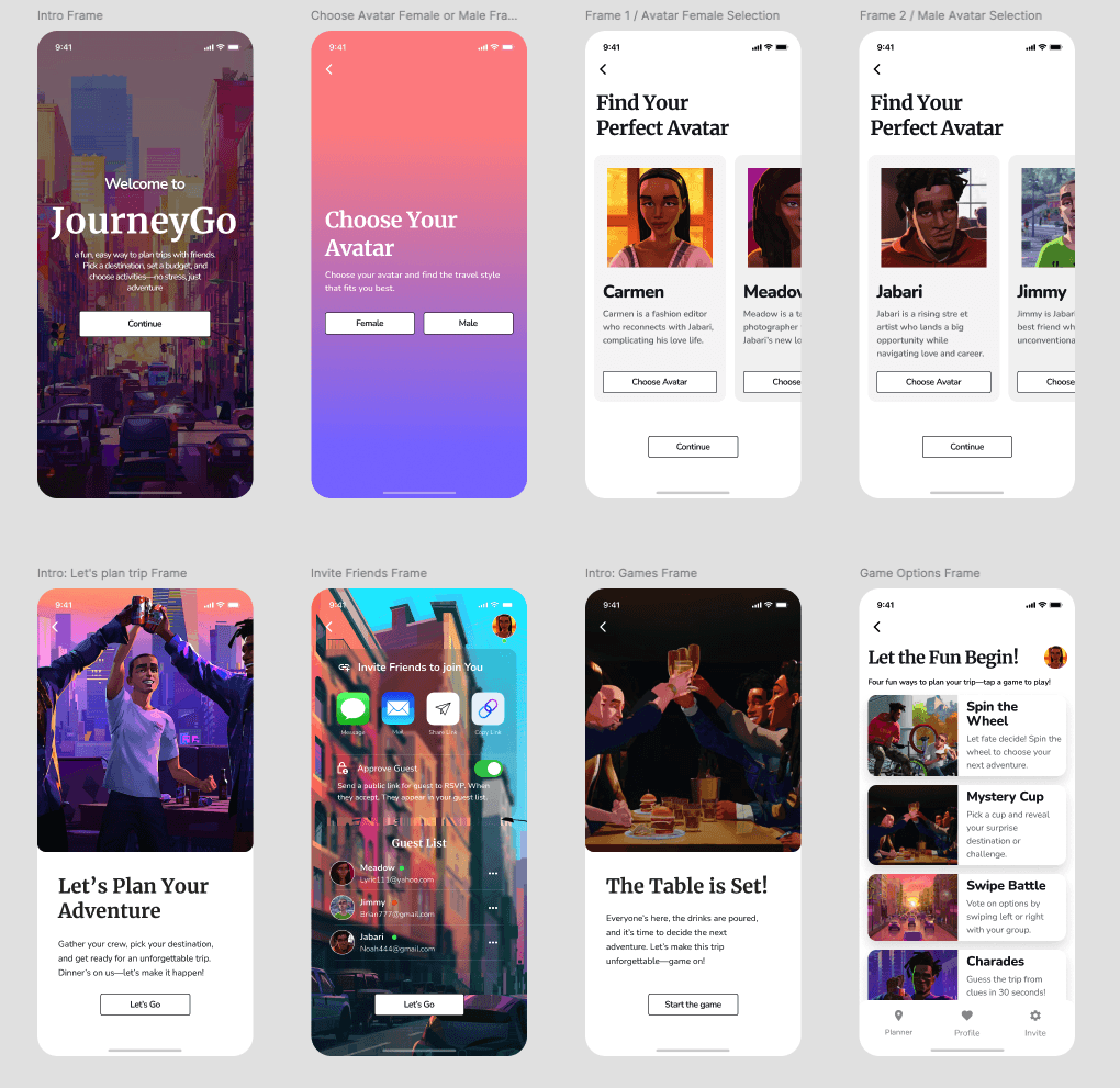
FINAL HI-FI SCREENS
The main goal during the design process was to create a seamless and playful experience for users planning group trips. As the project evolved, I made several refinements to improve layout efficiency and enhance key interactions—especially around gamified decision-making and the planning flow.


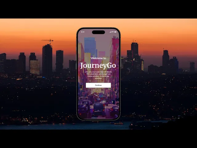
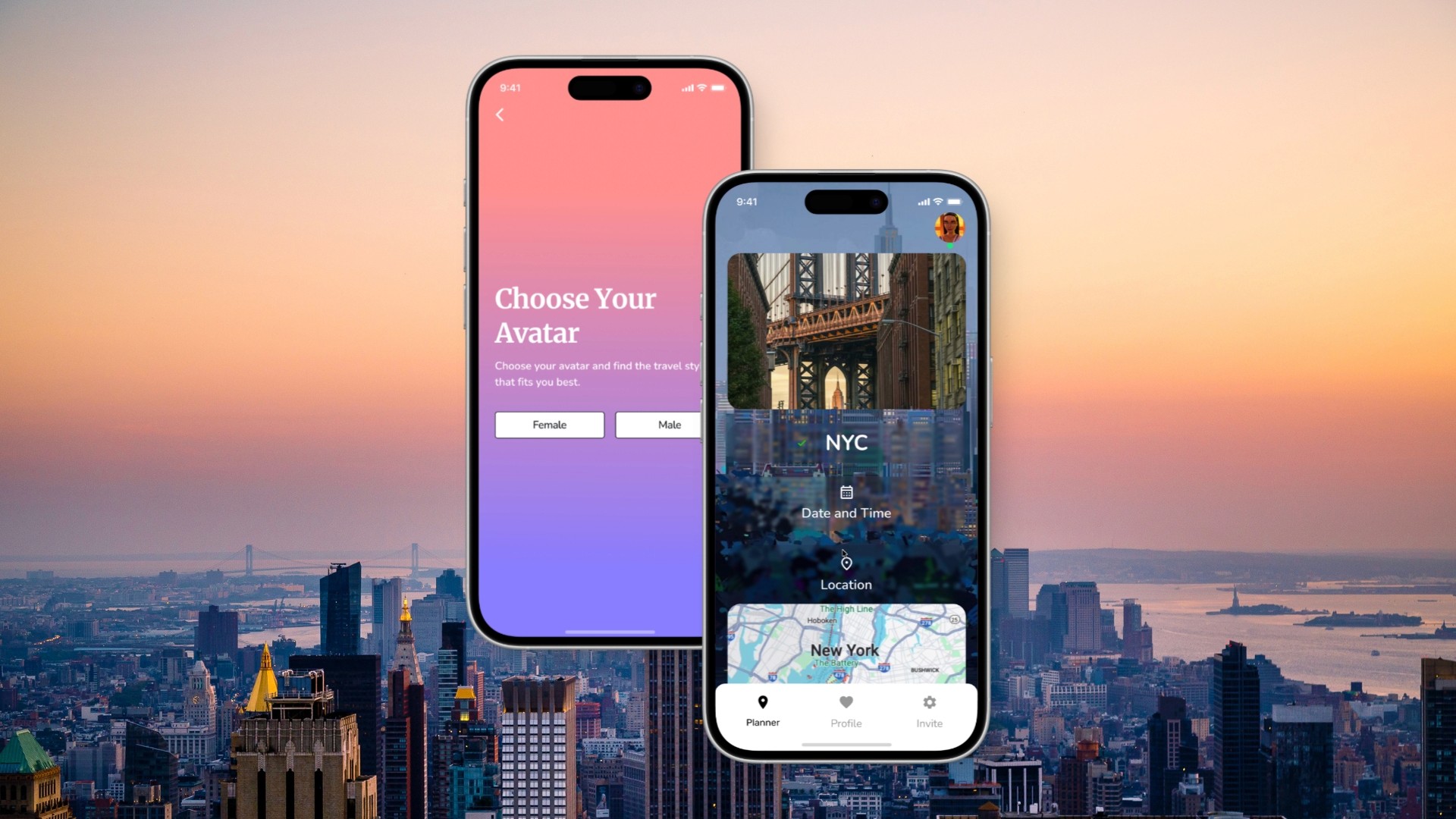
APP WALK-THROUGH
(Add something here)
MOCKUPS


TAKEAWAYS & LESSONS LEARNED
Working through this project taught me the importance of being intentional with every design decision—from structure to interaction. Usability testing played a key role in shaping the final product, helping me identify pain points, validate design choices, and make meaningful updates that improved clarity, navigation, and overall user experience.
As part of this paid project with MetaLab, I also received feedback highlighting my strengths in product thinking, originality, and user-centered design. I gained valuable insights into refining typography, visual hierarchy, and layout—skills I continue to develop to support clean, accessible, and engaging interfaces. If I had more time, I would conduct additional user testing and research, improve accessibility, expand to diverse user groups, and gather more feedback for continuous improvements.