


My Role
UX + UI Designer
Product Designer
Time
2 Months

Project Overview
Website redesign providing users with a clear and efficient way to navigate the museum's offerings, explore exhibitions, and access key information, ultimately enhancing their overall experience on the site.
About
The Museum of Modern Art (MoMA) situated right in the middle of Manhattan, New York, houses one of the greatest art collections in the world. Since the completion of its 425 million dollar renovation in 2004, MoMA has over 630,000 square feet of space, including 125,000 square feet for exhibitions and public programs.
Problem
The Museum of Modern Art (MoMA) in New York, a renowned institution with a substantial and diverse user base, faces challenges with its outdated website. The current design fails to resonate with the Gen-Z audience, affecting user engagement and satisfaction. The website’s navigation, visual appeal, and booking process are not aligned with modern user expectations, leading to a diminished user experience.

Solution

Process
EMPATHIZE
First Phase
User research
Target audience
User interview
Competitive analysis
PROTOTYPE
Fourth Phase
Lo-Fi wireframes
Hi-fi wireframes
Design systems
DEFINE
Second Phase
User persona
Empathy map
User journey
TESTING
Fifth Phase
Feedback
Conclusion
Future concept
IDEATE
Third Phase
User flows
User stories
Sketches
Information architecture
GROW
Sixth Phase
Reflect & grow as a designer

Target Audience:
Users aged between 21-35 years old, including young professionals, art enthusiasts, and individuals with varying needs, seeking a seamless and engaging online experience to explore art exhibitions, access museum resources, and plan visits with ease. Art should be a democratic form of expression, accessible to everyone, including individuals with special needs.
Current Website Analysis
As part of my evaluation of the MoMA website, I conducted a detailed usability review and identified several key issues: accessibility concerns, overuse of bright colors, layout issues, and a lack of white space. These findings highlight the need for a more accessible, user-centered redesign to improve overall usability.

User Research
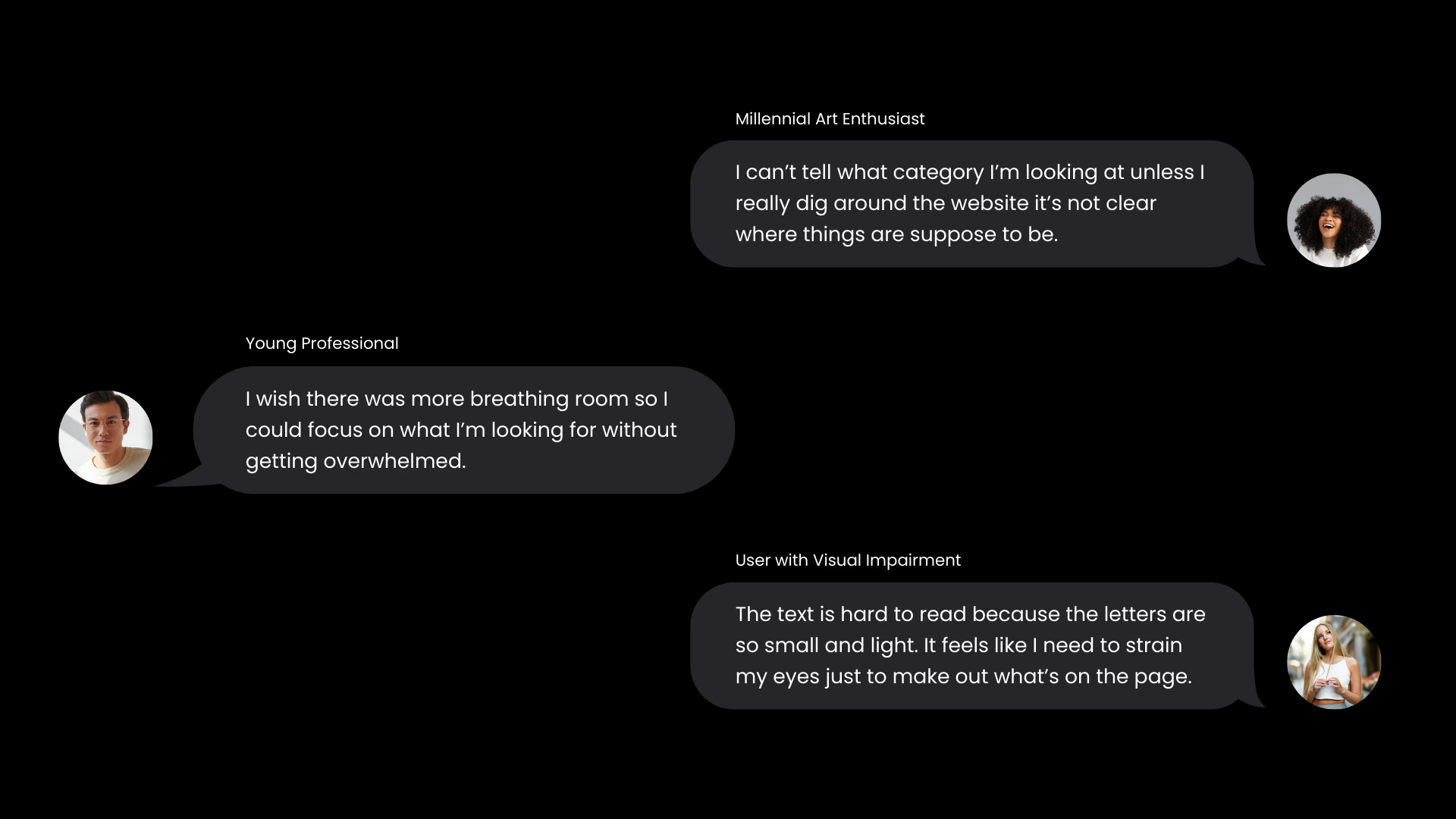
Interviews:

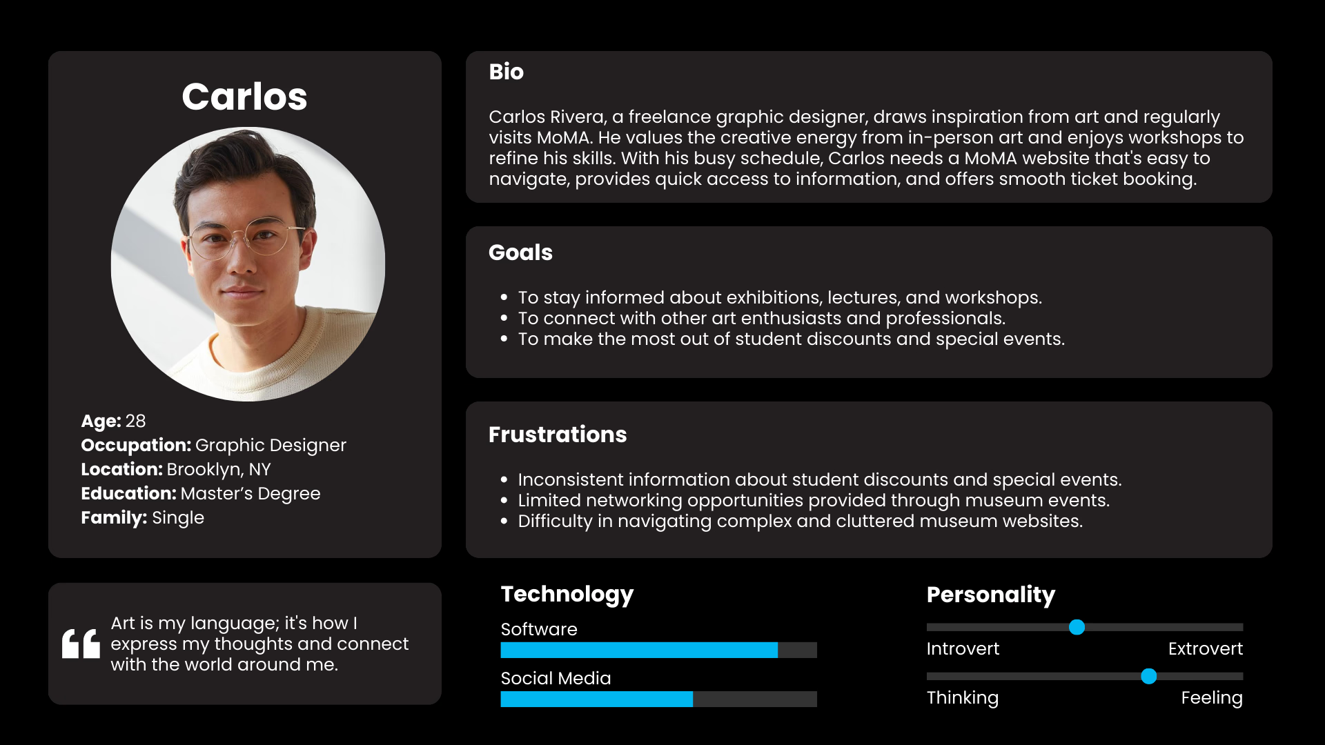
Persona

Empathy Map:

User Stories:

User Flow:

Wireframes

Wireframes

Solution
Comprehensive homepage redesign focused on improving accessibility, navigation, and user engagement.
